Bridal Brand

ever&ever Bridal Ad in The Knot

The ever&ever Bridal brand was featured in an advertisement in the Fall 2021 issue of The Knot magazine that I had the pleasure of art directing and designing.
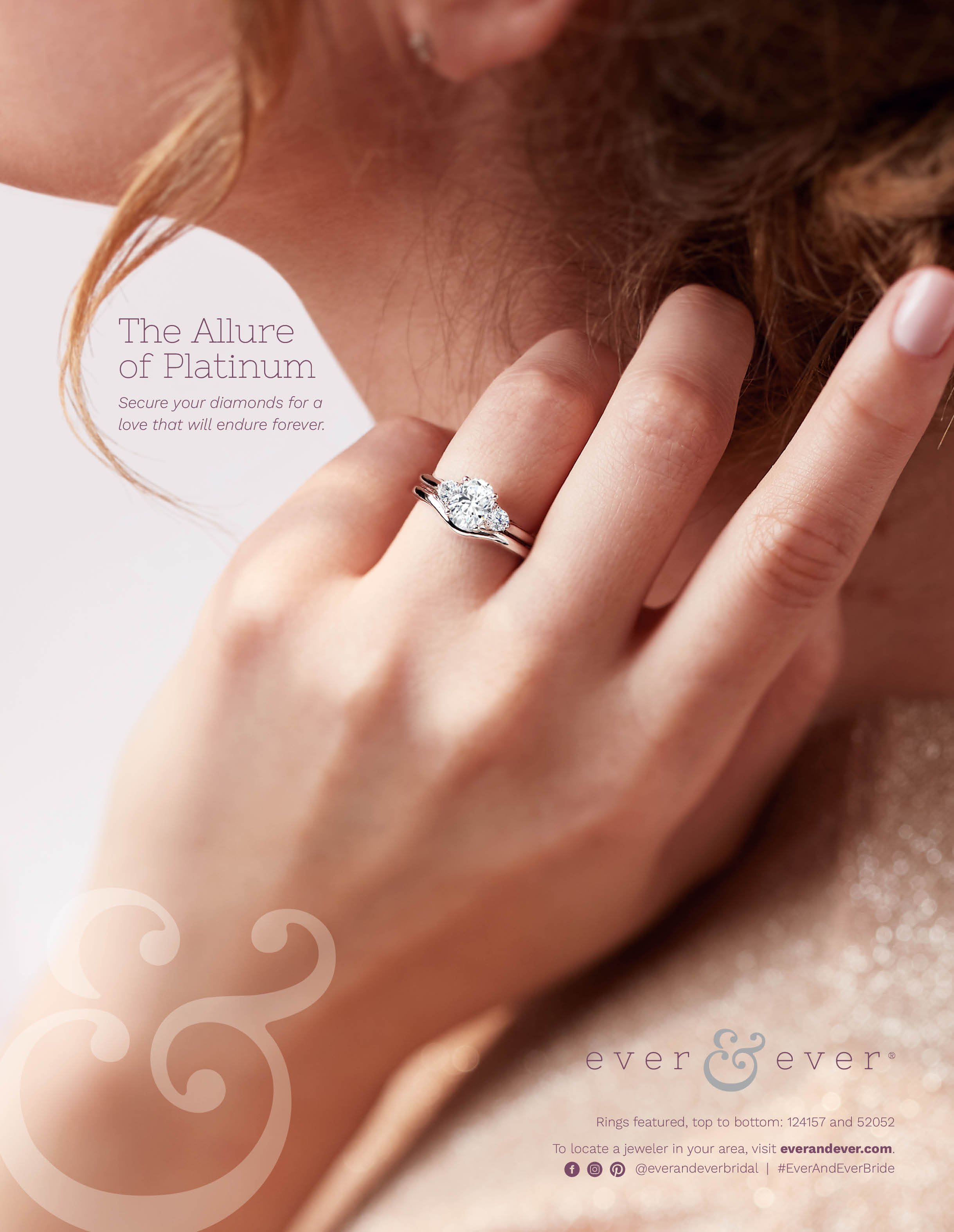
Full ad

ever&ever ad shown in The Knot magazine

Consumer Brochure

In Spring 2021, I designed this consumer-facing brochure to explain the perks of the brand to potential customers. I also art directed the photography with the goal of romanticizing the brand while still keeping it relatable and contemporary.

Video

In Spring 2021, I worked in collaboration with the video team to create this stunning brand video through styling and art direction.

Beyond the Glass

Beyond the Glass is a seasonal Stuller content publication where each issue is mailed out with the intent to be used as a resource and learning tool by front-of-store jewelers. Beyond the Glass is designed for a clean and calm reading experience that also feels editorial and engaging.

The Spring 2020 issue below highlights some of the ways jewelers can adapt their businesses as the market changes. Some of the issues touched on throughout the issue include sustainability, social media marketing, and analyzing consumer data.

My favorite aspects of working on this project include laying out the copy for each article (it’s like a fun but challenging typographic puzzle), art directing the photography, and brainstorming interesting ways to visually communicate important data to the jewelers.

I hope you enjoy looking through this piece as much as I did making it!

You can view the complete Spring 2020 issue as an online flipbook here.

The Fall 2019 issue below titled “Engaging Your Customers” focuses on engaging a jeweler’s audience (the end-consumer) through three avenues: on-trend designs, digital and social media, and in-store experiences. I really enjoyed the challenge of showcasing some of this information through graphics alone, particularly in the “Social Sell” article.

You can view the complete Fall 2019 issue here.

Digital Assets

For each publication, I create a variety of digital assets to help promote the issue online. Below are several sets of social media graphics as well as a blog header I designed for these issues.

“Trendlines” social graphics designed for a carousel Instagram post

“Trendlines” social graphics designed for a carousel Instagram post

Social graphics calling out specific articles and features in BTG

Social graphics calling out specific articles and features in BTG

BTG header for the Stuller Blog

BTG header for the Stuller Blog

Additional social graphics to promote BTG

Additional social graphics to promote BTG

302 Fine Jewelry (Brand Refresh)

In 2020, I had the honor to help define 302 Fine Jewelry’s brand refresh with an updated mission, brand values, tone, voice, and an overall more welcoming and contemporary editorial look and feel. Going through this process was incredibly exciting, and I am very happy to have helped bring the brand into its current form.

Below are some of the assets I’ve created since the brand refresh.

Photography

These images are an overview of some of the brand’s new photography style under my art direction. I aim to celebrate women and showcase their jewelry styles in a more relatable way using more relaxed poses and natural lighting while still creating photos that feel elevated and on-trend.

Social Media

I currently design the 302 Fine Jewelry Instagram grid each month. In collaboration with 302’s social media manager, I compose the feed, design graphics, and create gifs for 302’s Instagram, Facebook, and Pinterest accounts.

As the brand designer, I really enjoy incorporating all of our stunning photography into the grid as well as finding ways to graphically call out magazine features, 302 team highlights, motivational quotes, and specific products that contribute to the brand’s tone and voice. Below are some of the graphic styles I created for these types of posts as well as an overview of the grid design.

302 Fine Jewelry Instagram graphics

302 Fine Jewelry Instagram graphics

If you’d like to see even more, take a look at the current Instagram account here.

Web Banners

I also periodically design home page banners for 302FineJewelry.com such as the one below.

Welcome Box

Each new 302 Fine Jewelry retailer receives a Welcome Box which includes some informational materials, selling tools, and a few extra goodies. Below is the design I created for this Welcome Box, which was made as a kraft box to stay in line with the brand’s sustainability efforts.

302 Welcome Box

302 Welcome Box

Video

One of my favorite 302 Fine Jewelry projects to date has been styling and art directing the 302 video below. This video project was a fun collaboration with the video team, and I love the way we were able to showcase the brand’s upbeat vibe while featuring a variety of product.

Stuller Gemstones Brochure

In 2021, I designed Stuller’s first gemstones-focused brochure. The purpose of this piece was to give an overview of the wide array of gemstones, gemological tools, and services Stuller has to offer. I had such a fun time making the informative and vibrant print piece all about Stuller gemstones. One of my favorite aspects of this piece is the mix between colorful photography, bold type, and iconography throughout the issue.

Gemstones-Mock-Up-Cover.jpg
Gemstones-Mock-Up-Interior-Page-1.jpg
Gemstones-Mock-Up-Interior-Page-2.jpg
Gemstones-Mock-Up-Interior-Page-3.jpg
Gemstones-Mock-Up-Interior-Page-4.jpg
Gemstones-Mock-Up-Interior-Page-5.jpg

You can flip through the full brochure online here.

Celebrate Your Faith Spiritual Jewelry Lookbooks

2019 Lookbook

Showcased below is the 2019 Spiritual Jewelry Lookbook.

As the Graphic Designer and Art Director for this book, I created a theme for the project called “The Garden of Eden and Sweet Temptation”.

Deciding on a theme, creating a mood board, and pulling out the story and design elements ahead of time helped to inform the photographers’ and my decision-making surrounding the props, lighting, color scheme, and textures. This process helped guide us through creating the look and feel of each spread.

Screen Shot 2019-08-26 at 1.29.05 PM.png

Here are a few of the design and story elements I laid out ahead of time, along with the mood board:

Wherethe Garden of Eden, lush, colorful, dewey, and ripe with delicious fruit
Whena warm summer day, in the calm before the storm
Energysauntering, wondering, dreamy, tempting
Smellearthy, the smell of oncoming rain
Shapeorganic; leaves, water droplets, plump and juicy fruit, streaks of light
Lightbright where natural light pours in / dark where the trees cast their shadows; bright and flickering on the surface of the shallow ponds and waterfalls that create rainbows / deep dark at the bottom of the lake
Sound trickling water, bustling leaves, the low rumbling of thunder in the distance
Dichotomylight vs. darkness / peace vs. chaos / innocence vs. power / naivety vs. knowledge

You can see the way that calling these elements out ahead of time influenced the photography of the piece. I also incorporated hand-written style type into the photography to call out specific words with spiritual connotations to further emphasize the kind of jewelry within the piece and the connection the reader may have with them.

I wanted to be abstract rather than overt in drawing the book’s inspiration from the Garden of Eden, so we used grapes and pomegranate fruit rather than apples and textures reminiscent of snake scales instead of anything that looked more literally like a snake.

Blog Header

In addition to the print piece, I also created a header banner to be used in the Stuller Blog showcasing this project.

Social media banner for Stuller’s Facebook page

Social media banner for Stuller’s Facebook page

2018 Lookbook

Showcased next is the 2018, and very first, Spiritual Jewelry Look Book.

For this book, I came up with the a theme we called “Pilgrimage to the Mosaic Temple”.

Based on this theme, here are some of the design and story elements I laid out:

Where a mosaic temple
Whena cool Spring day
Energy introspective, spiritual
Smellpowder and citrus, anointing oils
Shapegeometric-patterned tiles
Lightsoft daylight, even-lighting
Textureweathered surfaces and stone

My goal was for this first book to feel pious and spiritual, humble and personal. I also wanted it to feel more worldly as opposed to only drawing from Western religious practices.

I also incorporated a hand-drawn script into the photography of this lookbook.


Mood board for “Pilgrimage to the Mosaic Temple

Mood board for “Pilgrimage to the Mosaic Temple

TownFolk Projects

TownFolk Projects

I created the artwork for TownFolk’s 2018 Victory Festival poster, which was also sold as a square print.

TownFolk is a non-profit organization in Lafayette, Louisiana whose mission statement is “neighbors helping neighbors.” Their efforts are focused in the LaPlace neighborhood where the organization was founded as a way to take on community projects in the area. The Victory Festival is their annual fundraiser for the Victory Garden, a community-garden in the LaPlace neighborhood, created to honor Jillian Johnson.

Read More

Bou-utiful Cosmetics

Pronounced “Boo-you-tee-full”, Bou-utiful Cosmetics is a beauty and skincare brand created by my sister Lindsey Boudreaux. I designed the logo, packaging, and social media graphics and assisted her with social media strategy as well.

Brand Theme

For this brand, I created a theme for the project called “Rainbow Jungle”.

Here are a few of the design and story elements I laid out ahead of time, along with the mood board:

bou-utiful-cosmetics-moodboard.png

Wherea lush and colorful jungle
Whena warm summer day, in the calm before the storm
Energybright, cheerful
Smellearthy, the smell of oncoming rain
Shapeorganic; leaves, water droplets
Lightbright natural light

Deciding on a theme, creating a mood board through rapid ideation and later refinement, and pulling out the story and design elements ahead of time helped to inform my decision-making surrounding the props, lighting, color scheme, and textures. This process helped guide me through creating the look and feel of the brand.

Logo

Below is the logo I created for the brand, which I wanted to feel bright and bubbly with a little bit on an edge.

Bou-utiful Cosmetics Logo

Bou-utiful Cosmetics Logo

Packaging

Bou-tiful Cosmetics Lip Balm Packaging

Social Media

Here are some of the quote style graphics I created for Facebook and Instagram to help portray the brand’s value of self-care.

Beau-utiful Cosmetics Social Media Graphics

Beau-utiful Cosmetics Social Media Graphics

Below is an over view of all the brand elements combined in the Instagram grid.

Beau-utiful Cosmetics Instagram Grid

Beau-utiful Cosmetics Instagram Grid

Holiday Gift Guide

Each holiday season, Stuller creates a Gift Guide to mail out to jewelers to use as a selling tool in their stores. For 2020, I acted as the Graphic Designer and Art Director over the photography for the project. Because of the distance and anxiety brought into everyone’s lives in 2020, we wanted this year’s book to feel calm and peaceful, and so we decided on the hygge-inspired theme and title: Focus on the Present.

Inspo moodboard created in the early stages of the project

Inspo moodboard created in the early stages of the project

Print Brochure

Holiday-Mock-Up-Front-Cover.jpg
Holiday-Mock-Up-Interior-2.jpg
Holiday-Mock-Up-Interior-4 copy.jpg
Holiday-Mock-Up-Interior-6 copy.jpg
Holiday-Mock-Up-Interior-7.jpg

View the complete B2B brochure here.

Social Media Assets

Below are some of the social media assets I created for Instagram and Pinterest to be used in the promotion of the Holiday Campaign.

Social media assets created for Facebook and Instagram

Social media assets created for Facebook and Instagram

Asset created for Pinterest

Asset created for Pinterest

Here’s a look at a promotional video created to compliment the Holiday campaign:

From classic bestsellers to new styles, Stuller has the perfect holiday gifts your customers will love!

Coco Case

Coco Case

Coco Case is a subscription service made for the modern working woman. Coco Case sends dark chocolates and specialty coffee blends to stimulate the subscriber during her work day. Each Coco Case comes in a fashionable small bag that can be repurposed as a make up case.

Read More

Year of the Wedding Digital Assets

Stuller’s Year of the Wedding Campaign

2021 is expected to be a big year for delayed celebrations that couldn’t take place in 2021, especially weddings. This year Stuller is promoting an ongoing campaign titled Stuller’s Year of the Wedding and below are some of the digital assets I have created for it so far.

Pinterest header banner

Pinterest header banner

Pinterest header banner, close up

Pinterest header banner, close up

Blog header graphic

Blog header graphic

Blog header graphic

Blog header graphic

Social media graphics

Social media graphics

302 Fine Jewelry (Original Brand)

302 Fine Jewelry’s original brand was conceived as a curated collection of on-trend fashion jewelry. 302’s Fine Jewelry’s tagline was “Exciting / Exhilarating / Electric”. The lookbook below showcased 302’s original version of the brand before the refresh and some of its popular pieces. The original branding aimed to be sharp, edgy, and striking.

Lookbook

View the complete lookbook here.

Social Graphics

Below are several social media graphics I designed to post on Stuller’s Instagram and Facebook accounts to help promote the brand.

Social media graphics

Social media graphics

Styles Guide

The 302 Fine Jewelry Styles Guide below showcases every jewelry piece in its respective collection.

Courir de Mardi Gras Series

Enamel Pin

I created this playful pin of a Mardi Gras reveler’s mask as a personal project after my first experience at the Cajun/Country courir de Mardi Gras in Savoy, Louisiana. This soft enamel courir mask pin is perfect for Mardi Gras celebrations.

Postcard

This postcard was also created after my first courir de Mardi Gras experience using one of my double-exposure film photos from that day and the same enamel pin illustration. It features the phrase “Dance, Mardi Gras!” which was called out to us often throughout the day of the courir. During the courir, all reverlers are referred to as “Mardi Gras.” You’re Mardi Gras, I’m Mardi Gras, we’re all Mardi Gras!
Buy Now →

Lafayette Neighborhood Pride Map

My Lafayette Neighborhood Pride Map showcases many of the historic neighborhoods surrounding the Downtown Lafayette Area along with icons depicting some of their landmarks, personalities, and features.

I aimed to make this map playful and fun! The primary colors are Inspired by the Acadiana Flag (red, yellow, and blue) since Cajun heritage has a significant history in the area. Lafayette is considered the “Heart of Acadiana”, and the area covered in this map includes Lafayette’s original city-limits.

Read More