

OK Soda was a soft drink created by The Coca-Cola Company in 1993 that aggressively courted the Generation X demographic with unusual advertising tactics.It did not sell well in select test markets and was officially declared out of production in 1995 before reaching nation-wide distribution. The drink’s slogan was “Things are going to be OK.” Spokespeople for the company and their advertisers were very frank about the fact that they were marketing the drink entirely on the “feeling” rather than the taste.
Both the cans and the print advertisements for the soft drink featured work by popular “alternative” cartoonists Daniel Clowes and Charles Burns. Unlike the brightly colored Coca-Cola cans, they were decorated in drab shades of gray, with occasional red text. In addition to the primarily two-tone illustrations, the cans would feature a special code that could be entered at the given 800 number as well as a “Coincidence”, which was usually some odd bit of trivia about some town in the United States. They would also sometimes contain messages from the OK Manifesto, which was a series of platitudes about OK-Ness, pithy thought reform sayings with no real meaning, doublespeak, mocking traditional advertisement slogans or catch-phrases. Some cans had similar messages printed on their inside..

But you have to ask with your heart ©Azumi Sakata
Artis: Azumi Sakata

Artist: Dimitris Makrygiannakis

Artist: Elena Helfrecht
Website: http://elenahelfrecht.com

Hand embroidery on natural linen.
Artist: adipocere

“Oh! Great Lady of Fascination! We arise in somnambulant awe and dance entranced as you glide slowly and softly through the Heavenly Dome and suffuse our presence with unfathomable desires for faerie worlds, where all is order, where all is beauty, where nuances of quality proliferate miraculously in myraids of delicious subtleties.” ~ Lady Svetlana
*Image: Grave marker - Berlin Cemetery.
Photographer: symboter
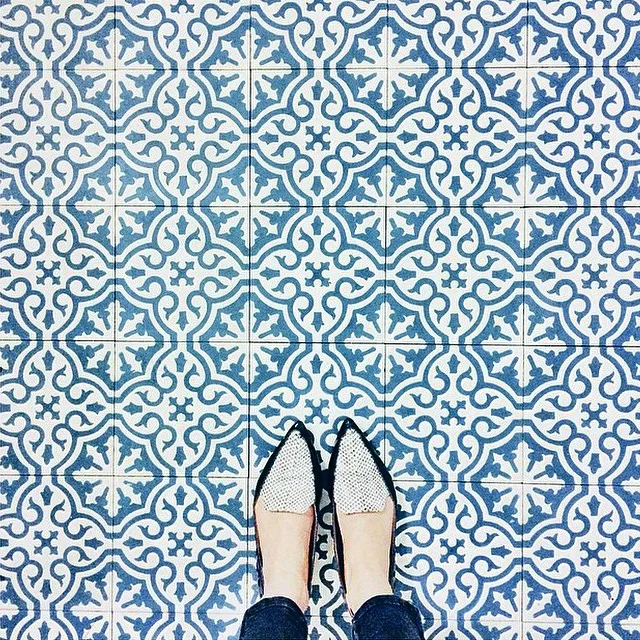
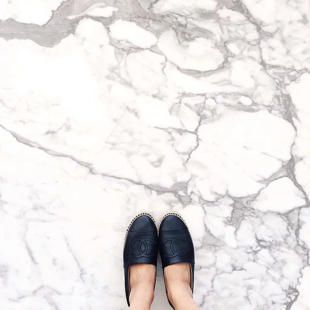


But first, let me take a #selfeet. Explore a new perspective with Instagrammer @ihavethisthingwithfloors and see what happens “When feet meet nice floors” (and get some great new shoe ideas). It’s a mosaic-lovers paradise!

Artist: Witchoria
Website: http://witchoria.com


Artist: David Uzochukwu


Luminous Words: Glowing Books by Airan Kang
South Korean artist Airan Kang creates striking illuminated books or “electronically luminescent sculptures cast from transparent synthetic resin” for her Luminous Words series.
The books are currently on exhibition at the Bryce Wolkowitz Gallery in New York. digital lighting books
“Featuring an ambitious installation of over one hundred digital lighting books and new LED paintings, Luminous Words furthers Kang’s exploration into the ontology and evolution of the book as a source of knowledge in the digital era. ”
Something different, right? quienesesachica
Amazing!


Labels are for clothes not for people.


blackreignbow see, delicate lady flower
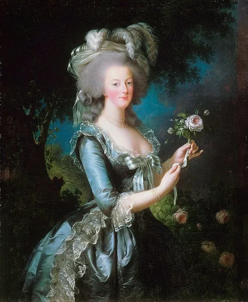
Marie-Antoinette dit « à la Rose », Marie Louise Élisabeth Vigée-Lebrun, 1783; Versailles MV 3893
I haven’t done a portrait costume analysis in a long time, but it seemed like the most appropriate way to deal with the second Historical Sew Monthly challenge: Blue.
This portrait of the twenty-eight-year-old Marie Antoinette was painted in the same year as the famous portrait en chemise - in fact, it was painted in order to replace the chemise portrait with something less scandalous. (You may notice that she’s standing in the same pose, holding the same ribboned rose, with the same hairstyle and same expression.) While this blue taffeta gown is more traditional than the chemise, it’s nothing like a robe de cour or arobe parée - two outfits worn daily at court for formal occasions. This is still a very fashionable and casual ensemble.

